Amber Rebranding
Client: Pattern Agency, Subclinet: Amber.
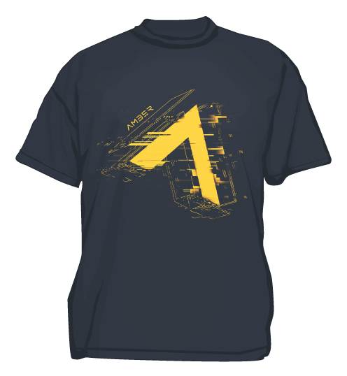
Amber is a game development company, which needed a more playful, adaptive and gameing orientated branding solution.
How do you rebrand a gaming company while keeping their ethos? For Amber it all starts with a desire to be forward-facing.
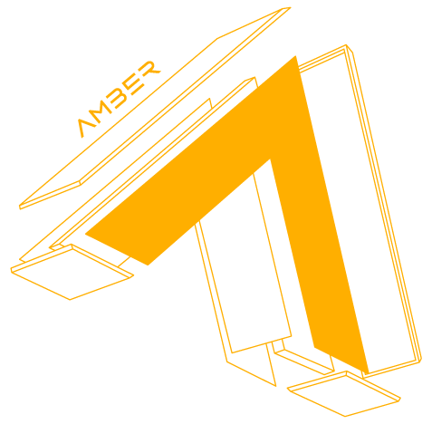
An isometric perspective allows the logo to become aware of the space it inhabits on the X-Y axis.
An arrowhead that defies the constraints of bi-dimensional space so that it can set the tone for a new geometry while being mindful of its beginnings.
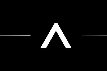
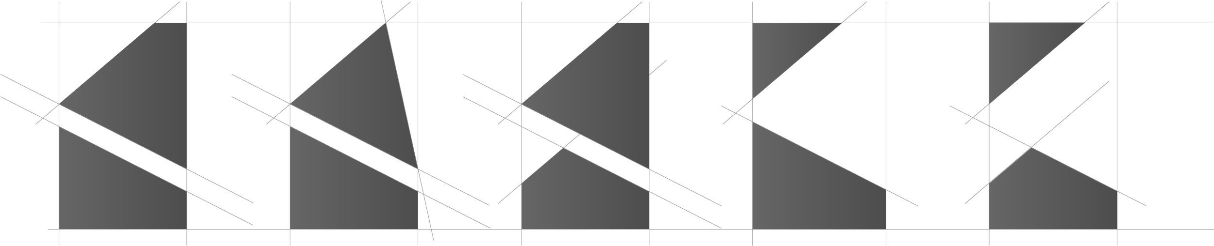
Logo Evolution

Old
Transition

New
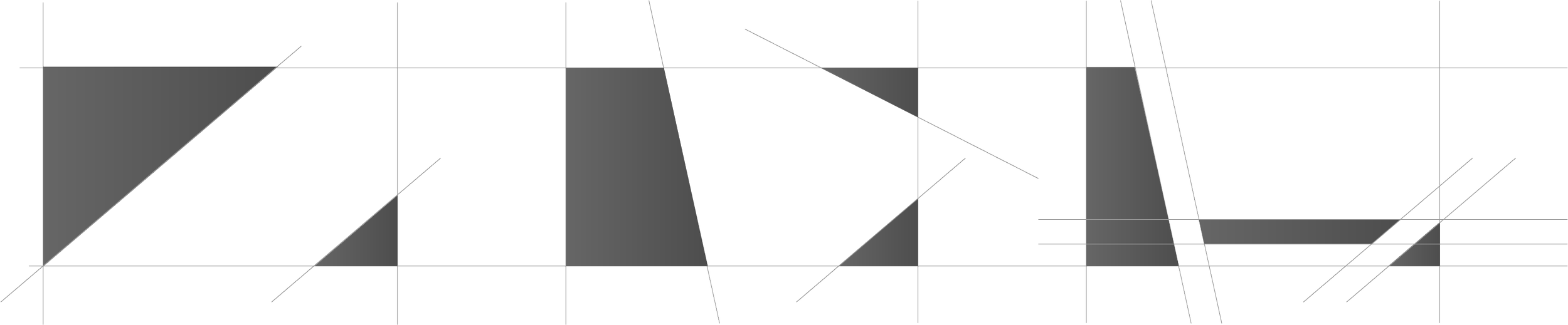
Amber brand geometry is generated by the intersection of 5 axes – the horizontal, the vertical and the three axes given by the new logo.
By combining these axes, different shapes are generated.
All these shapes generated by the 5 axes can be used in presentation templates, posters, headers, etc.

Generation Brand Geometry
Brand Colours
Primary Gradients
Colours
Amber Guilds Logo
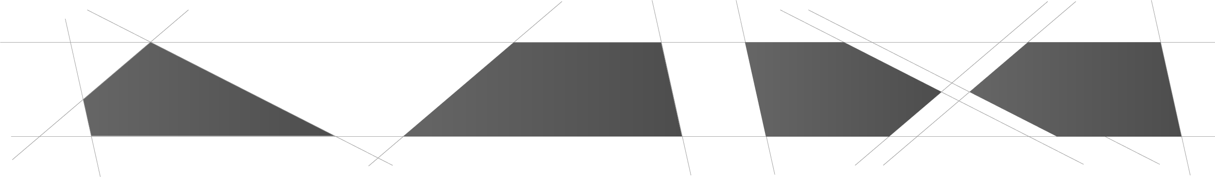
Layout Evolution

Old layout

New layout
Secondary Graphic Element
/ The Amber Glitch /


This highly flexible effect element is designed for use in photos, deck presentations and some promotional materials.